Carousel
An interactive image carousel component with smooth transitions, swipe support, and responsive sizing. Perfect for showcasing photos, product images, or any visual content.
Live Demo


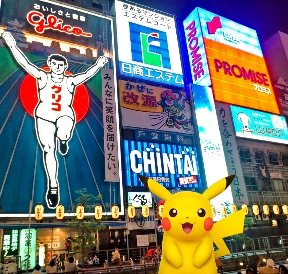
Custom image inside the carousel
It can be useful if you want to make some modifications to every image you passed into the component
In this example you can see the ball floating on top of the image
This can be achieved like that
<orio-gallery-carousel
  style="margin: auto"
  :images="images.map((image) => `${basePath}/${image}`)"
>
  <template #image="{ image }">
    <div class="image-container">
      <img class="base-image" :src="image" />
      <img class="design-overlay" :src="`${basePath}/ball.png`" />
    </div>
  </template>
</orio-gallery-carousel>

<style scoped>
.image-container {
  position: relative;
  width: 100%;
  height: 100%;
}
.base-image {
  width: 100%;
  height: auto;
  height: 100%;
  object-fit: contain;
}

.design-overlay {
  position: absolute;
  top: 20%;
  left: 20%;
  width: 20%;
  height: auto;
  object-fit: contain;
}
</style>
Minimal appearance
Use appearance="minimal" to strip the border and background from the carousel. Navigation arrows are hidden and only appear on hover — ideal for embedding the carousel directly into page content without a visible widget frame.
<orio-gallery-carousel :images="images" appearance="minimal" />Dynamic size based on image size
Just pass one part of the size and it will adjust to the size of the real image
Usage
<script setup>
const basePath = "/samples";
const images = [
  "horizontal-sized-photo.png",
  "mobile-sized-photo.png",
  "square-sized-photo.png",
];
</script>

<div class="demo-container">
  <orio-gallery-carousel :images="images.map((image) => `${basePath}/${image}`)" />
</div>
Props
| Prop | Type | Default | Description |
|---|---|---|---|
images | string[] | [] | Array of image URLs to display in the carousel |
size | string | "400:550" | Carousel dimensions in "width:height" format (e.g., "800:600") |
fit | "fill" | "cover" | "contain" | "scale-down" | "contain" | CSS object-fit property for images (how images fit within container) |
appearance | "default" | "minimal" | "default" | Visual style. minimal removes the border/background and hides navigation until hovered |
Model
| Model | Type | Description |
|---|---|---|
activeImage | string | Currently displayed image URL (v-model ready) |
Features
- Smooth Transitions - Images slide in/out with fade and transform animations
- Navigation Controls - Previous/next buttons with auto-adapting colors for visibility
- Swipe Support - Touch and mouse drag gestures for natural interaction
- Responsive - Automatically scales to fit container while maintaining aspect ratio
- Keyboard Navigation - Navigate with arrow keys (when focused)
- Flexible Sizing - Control image fit behavior (contain, cover, fill, scale-down)
- Loop Navigation - Seamlessly loops from last to first image and vice versa
- Minimal Appearance - Borderless, backgroundless mode with hover-reveal navigation
Usage Examples
Basic Usage
<script setup>
const images = [
  "/images/photo1.jpg",
  "/images/photo2.jpg",
  "/images/photo3.jpg",
];
</script>

<template>
  <orio-gallery-carousel :images="images" />
</template>
Custom Size
<template>
  <!-- 16:9 aspect ratio, 800px wide -->
  <orio-gallery-carousel :images="images" size="800:450" />
</template>
Different Image Fit Modes
<template>
  <!-- Contain: Show entire image (may have letterboxing) -->
  <orio-gallery-carousel :images="images" fit="contain" />

  <!-- Cover: Fill container (may crop image) -->
  <orio-gallery-carousel :images="images" fit="cover" />

  <!-- Fill: Stretch to fill (may distort) -->
  <orio-gallery-carousel :images="images" fit="fill" />
</template>
Minimal Appearance
<template>
  <!-- No border/background; navigation arrows appear on hover only -->
  <orio-gallery-carousel :images="images" appearance="minimal" />
</template>
Controlled Active Image
<script setup>
import { ref } from "vue";

const images = ["/img1.jpg", "/img2.jpg", "/img3.jpg"];
const currentImage = ref(images[0]);
</script>

<template>
  <orio-gallery-carousel v-model:activeImage="currentImage" :images="images" />

  <p>Currently showing: {{ currentImage }}</p>
</template>
Interaction
Mouse/Touch
- Swipe/Drag Left - Next image
- Swipe/Drag Right - Previous image
- Click Arrows - Navigate to adjacent images
Threshold
The swipe threshold is currently set to 10 pixels. A swipe must exceed this distance to trigger navigation.
Styling Notes
- The component uses CSS custom properties from your theme
- Navigation buttons automatically adapt to background brightness on Chrome/Firefox
- Safari uses a fallback styling with white icons and shadows for better compatibility
- Images are non-draggable to prevent interference with swipe gestures
Accessibility
- Navigation buttons include icon labels for screen readers
- Images should have meaningful alt text (currently uses image URL as fallback)
- Consider adding keyboard navigation support for better accessibility